Transforming Your Neutral Kitchen: 3 Key Undertones for Warmth
After painting your kitchen in what seemed like the perfect neutral hue, you may feel a certain chill in the air. Sometimes, the space can appear dull or even cold.
This is a frequent issue faced in neutral kitchens, primarily due to the undertone of the paint color chosen. A shade that looks inviting in one kitchen may not have the same effect in yours.
Factors like the direction your kitchen faces, the amount of natural light it receives, and the other colors present all influence how a neutral paint color is perceived. Let's explore how designers effectively address this issue and the undertones they use to warm up cold kitchen designs.
Why Neutral Kitchens Can Feel Cold
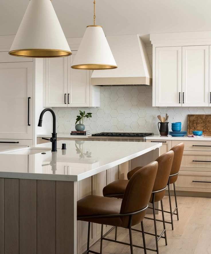
'In this kitchen, we chose a soft white paint which avoids cooler blue undertones that often make a space feel stark. It harmonizes beautifully with natural materials,' explains a designer.
Color has the power to dramatically change the ambiance of a kitchen. We're not just talking about vibrant colors; even within neutral palettes, some shades can evoke warmth and comfort, while others can feel cold and sterile.
It usually boils down to undertones. Various neutral shades come with distinct base tones that dictate their appearance in a room. While external factors play a role, designers often highlight specific undertones that tend to create a chilly atmosphere.
'Undertones significantly influence whether a neutral kitchen feels inviting or slightly off,' notes an interior designer, suggesting that avoiding certain undertones can help prevent a cold kitchen.
'I recommend steering clear of whites and neutrals with strong blue bases. These can seem crisp on a paint chip, but in real spaces with wood, stone, and warm metals, they often clash,' she advises.
Another expert agrees, stating, 'To steer clear of a cold feel, be cautious with neutrals that have strong blue or green undertones, as these can appear cooler in various lighting. Crisp whites can feel less welcoming depending on the room's light.'
Selecting the Right Undertones for Your Kitchen

This kitchen features warm yellow undertones to counteract any chill.
Determining which undertones promote a warm vibe in your kitchen involves more than just formulas; you need to consider how those undertones interact with your unique space.
'Start with fixed elements like your flooring and window frames, but most importantly, assess the light. Natural light brings warmth. Think of a sunny day and how it casts a golden glow. It's only on gray days that light seems cool and flat. A kitchen bathed in natural light will always lean warm, and your undertones should complement that,' advises another designer.
Lighting is crucial when selecting the right undertones for your kitchen. The amount of daylight and the direction it comes from will greatly affect how these undertones are perceived. Bright sunlight will enhance warmth, while cooler, indirect light can create a chillier atmosphere.

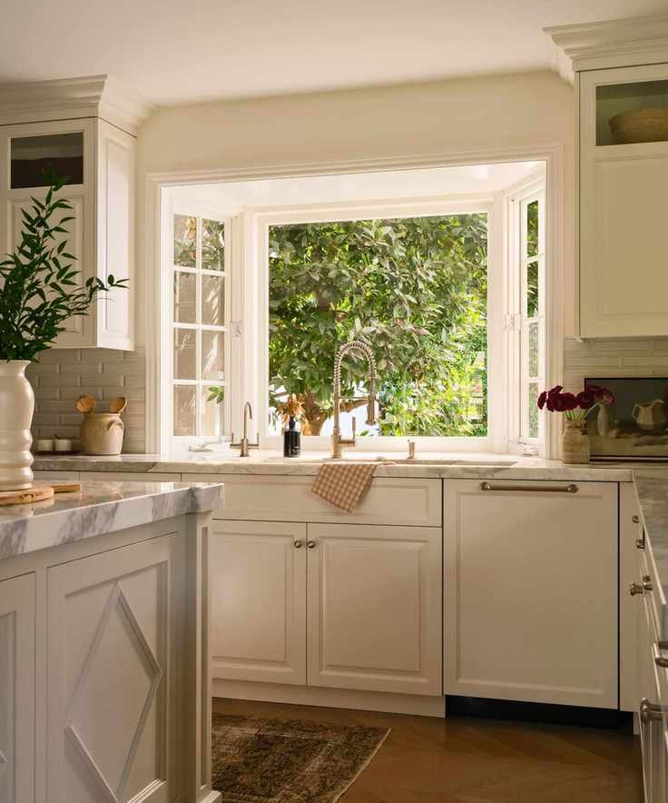
Here, subtle beige and yellow undertones in the cabinet color foster warmth and approachability.
'Lighting is key, so always test samples in the actual space and observe how they evolve throughout the day,' recommends another expert. 'Consider fixed elements like cabinetry, countertops, and flooring, and choose undertones that enhance those finishes. Side-by-side sampling is the best way to guarantee a cohesive look.'
Don't overlook existing materials in your kitchen. 'Often, we see clients wanting to cool down the warmth of tiles or countertops by picking a colder cabinet color. This can create a stronger contrast, making the tile and countertop appear even warmer. Aim for harmony among the undertones of all colors in your design,' emphasizes a color expert.
'The key principle: warm light needs less help, while cooler light requires warm undertones through wood, brass, or linen-toned cabinet paint. If you're uncertain, bring samples home and observe them throughout the day. The kitchen that feels right at noon should still feel right at dusk. That's your winner,' says the designer.
Three Undertones Designers Favor for a Cozy Neutral Kitchen
Beige and Greige
Beige and gray undertones in this kitchen paint color contribute to the warmth of the greige cabinetry.
Beige has become a highly sought-after neutral, and greige tones offer warmth compared to stark whites and blue undertones. They soften pure white but be cautious with gray undertones—cool gray can create a cold atmosphere, whereas greiges are warmer.
'Warmer undertones foster a more inviting and livable kitchen. Soft beige, taupe, and creamy whites add subtle warmth and depth without overwhelming the space,' notes the color expert.
- Beige undertones: Accessible Beige SW 7036
- Taupe tones: Joa's White
- Greige undertones: Fossil AF-65
Yellow
Warm yellow undertones in this cream kitchen enhance brightness and approachability.
Yellow undertones naturally promote warmth in neutral paints. Consider those warm whites and creams that draw you in for a softer finish.
Yellow undertones often appear in some beige and light brown hues, providing a soft and inviting atmosphere. Paint colors with yellow undertones are ideal for kitchens that receive cooler, flatter light, as they mimic the warmth of sunlight.
'We favor warm beige, honey, and soft organic tones that feel vibrant rather than flat. The sweet spot: creamy whites with yellow or linen undertones, woods with amber or honey hues, and stone that reads more taupe than blue,' says the designer.
- Yellow/greige undertone: Natural Linen SW 9109
- Soft yellow undertones: Standish White HC-32
- Warm yellow undertones: Wimborne White
Pink and Red
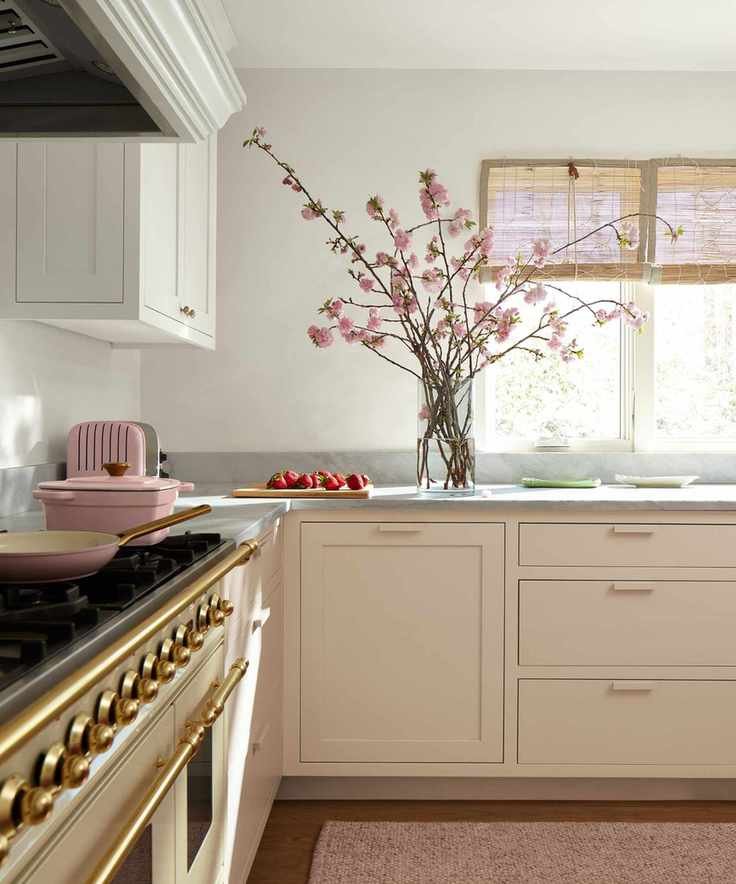
'Pristine OC-75 on the cabinets adds a soft warmth to the neutral space,' notes the color expert.
Neutral colors with pink or red undertones are some of the warmest options, contrasting with colder blue undertones. 'For a warm and welcoming touch, opt for hues like reds, pinks, and oranges,' suggests the designer.
'These shades have an inherently inviting quality, preventing them from feeling cold or sterile. Ultimately, color is subjective, so embrace the hues that resonate with you.'
- Pink undertones: Cocoa Butter 1023
- Dusty pink undertones: Dusty Road 1017
- Peach undertones: Pristine OC-75
Understanding kitchen paint color undertones is crucial, as there's no one-size-fits-all solution. It's essential to consider the natural light your space receives and how different colors interact with other materials in your kitchen. Having multiple options can provide clarity.
'We typically start with three carefully chosen options and meet on-site to evaluate them together. Observing everything in context, under the home's natural light, allows for confident decision-making,' shares the designer.
'A well-selected neutral should feel like it belongs in the room without drawing attention to itself.'