Beige-Grey: The Timeless Paint Color for a Subtle Backdrop
Looking for the perfect paint color to refresh your home this spring? This chic beige-grey shade is trending and might just inspire you to re-paint.
While bold colors and vibrant designs have their appeal, a neutral backdrop lets architectural features and unique furnishings truly shine. This understated hue serves as an excellent foundation for more daring accents throughout your home.
According to Rob Whitaker, creative director at Claybrook, using this 'smart neutral' as the primary color provides a framework for incorporating bolder tones elsewhere. Designers are finding inventive ways to introduce brighter shades while ensuring they remain livable and enduring.
Maximizing Your Neutral Color Scheme
When planning your design, consider the overall color scheme right from the start. This approach helps shape other elements of your space as the project evolves. For example, pairing this beige-grey with materials like timber and marble can elevate its elegance.
Charu Gandhi, founder and director of Elicyon, suggests, 'I adore leathered marble for its texture and warmth. Pairing neutrals with suede and crafted wool rugs adds depth. Incorporate ceramics and colored glass to keep the decor lively and avoid a dull atmosphere.'
For those uncertain about their design direction, a neutral backdrop can be a wise choice. It's essential to select the right tone for your space and then bring in color through furniture, lighting, and textiles. If you're unsure, consulting a color wheel can offer valuable inspiration.

Advantages of Beige-Grey in Your Home
Check out some of our top insiders' suggestions on creatively utilizing beige-grey in your decor.
1. Sample Paint Colors for the Right Tone

In a mid-century apartment in London's Marylebone, classical details like herringbone floors blend with modern wall moldings to create a stunning entryway designed by Base Interiors.
Deborah Base, director at Base Interior, emphasizes, 'Achieving the right balance between natural light, artificial light, and various textures is crucial. Testing paint samples in different lighting conditions throughout the day is essential.'
The walls are painted in 30YY 78/035 from Dulux Trade, providing the ideal backdrop for architectural details and bespoke art pieces.
2. Add Warm Accents
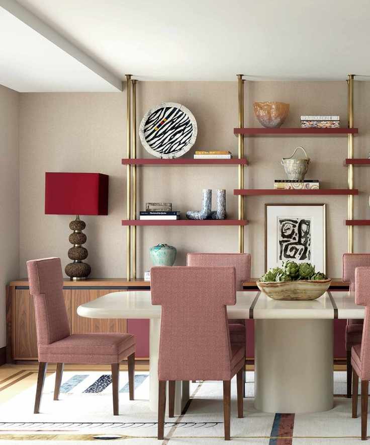
In this dining room by Natalia Miyar, soft rosy hues create a warm contrast against a neutral backdrop, ensuring the space remains sophisticated with elegant decor.
'Pink complements taupe beautifully,' shares Natalia Miyar, director of Natalia Miyar Atelier. 'Often seen as too feminine, it can actually convey a refined statement. In my own London apartment, I embraced a pink palette for its cozy charm.'
To add depth, color consultant Judy Smith from Crown suggests incorporating burnt orange and mustard. For a striking look, consider deeper shades like dark olive or black alongside washed tones of cream, grey, and brown.
3. Maintain a Clean and Crisp Aesthetic

In a Grade II listed mansion in Berkshire, Albion Nord created a serene main bathroom where soft colors enhance the expansive rural views.
Ottalie Stride, creative director at Albion Nord, remarks, 'This versatile neutral offers a warm, inviting atmosphere that pairs perfectly with crisp white ceilings and woodwork.'
For the walls, they chose Slate II from Paint & Paper Library, which beautifully contrasts with the standout freestanding Collete bath by Waterworks.